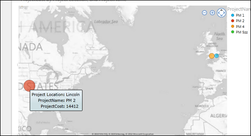
This post will take a brief look at creating a map view of Project Server data – this does assume you tag your projects with a location!
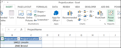
For the purpose of this post I will use the example Excel file shown below – this pulls data from one of my test Project Server PWA instances, hence the project names!
In Excel 2013, click Insert > Power View Reports:
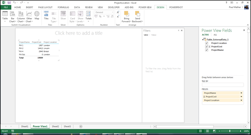
You will now see a Power View report:
To create a map with the projects plotted in the correct location by cost, see the steps below.
On the design tab, click Map and you will see the following:
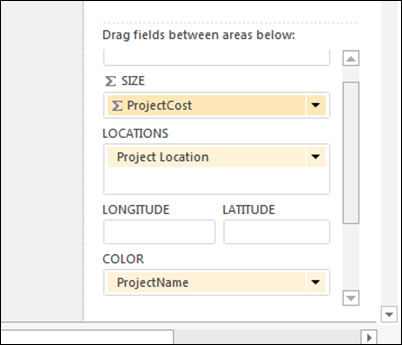
Now click the map and modify the Power View fields shown below:
For this example, add ProjectCost to the size property, add Project Locations to the Locations property and set the colour property to ProjectName:
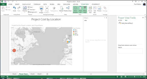
Increase the size of the map and add a title:
You can hover over the data circles and a tooltip will appear with the project details:
The data can be refreshed and the map updates.
A quick and simple report to show projects by location.


